Colors
Color is a tool to maintain brand identity as a product, and it should be able to express clear information hierarchy within the software through color contrast to minimize user confusion.
Update Types
🟠 Existing Update
🔵 New Addition
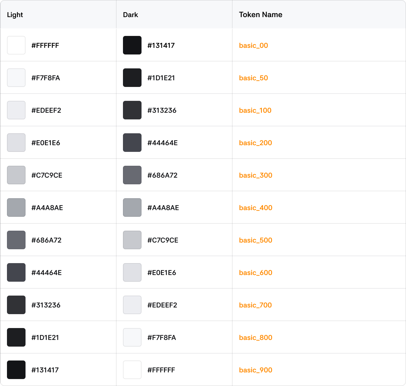
Basic Color
Scale Token is a standardized color token that defines a consistent color system for the product. It is used when there is no specific semantic characteristic or context, and Scale Tokens can be used in any case.
Grayscale
The most basic black and white colors with no transparency.
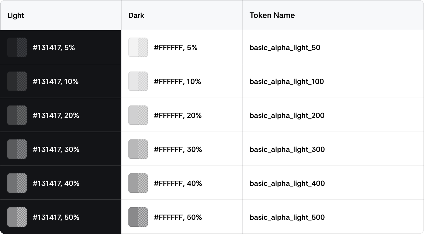
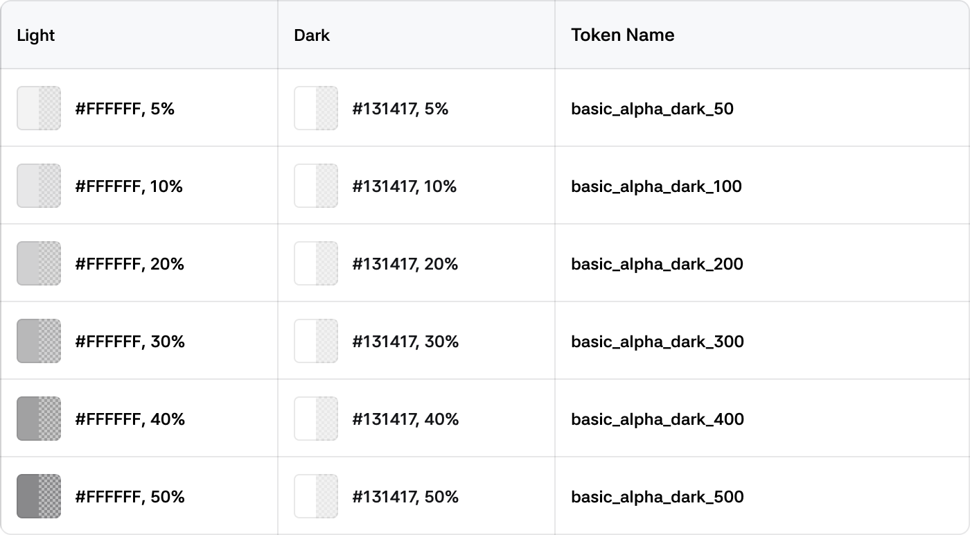
Alpha Color
Colors with transparency, mainly used in combination with backgrounds or other elements by adjusting transparency.
White Alpha
Gray Alpha
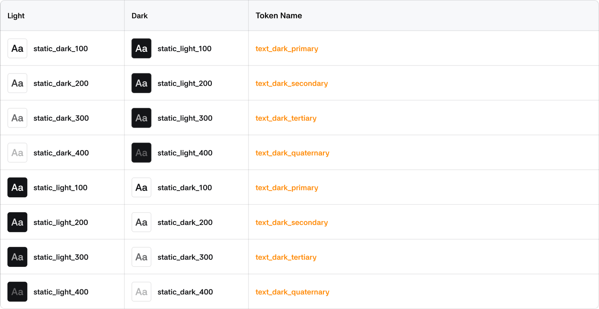
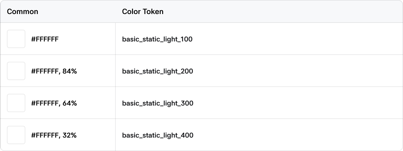
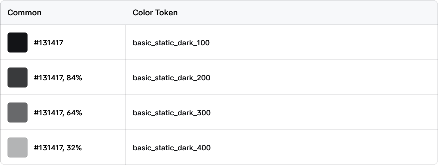
Static Color
Colors that are not affected by light or dark themes and always retain raw values. Primarily used for elements that appear on top of overlays.
Light
Dark
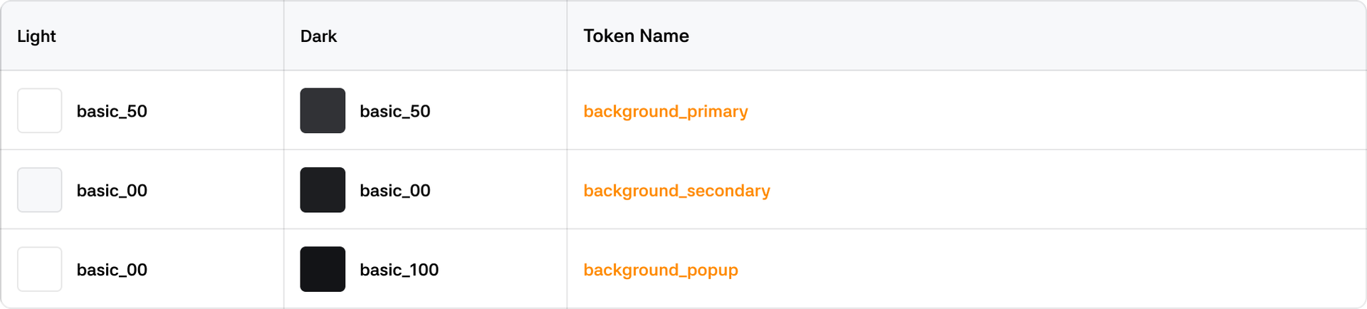
System Color
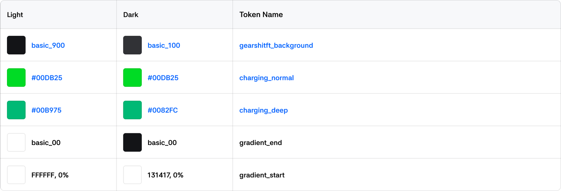
Background
The background color that wraps content and information. Located at the lowest level of the Z-axis.
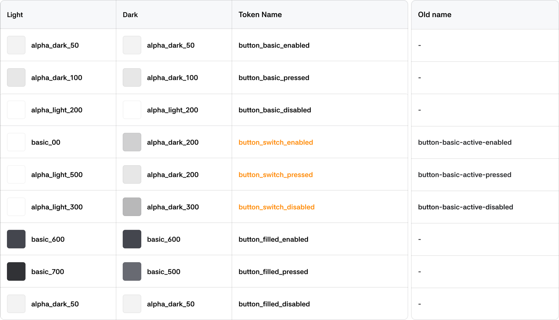
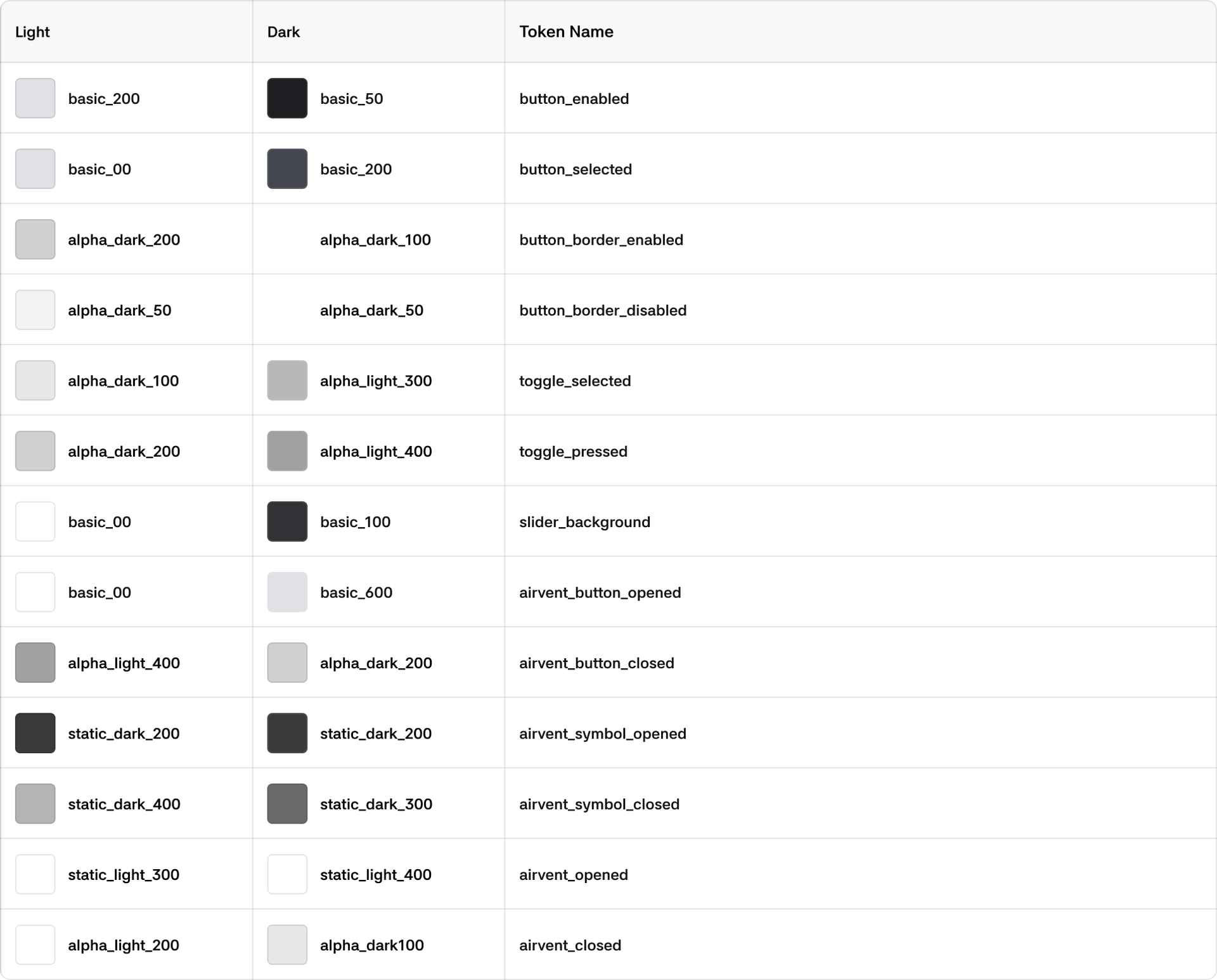
Button
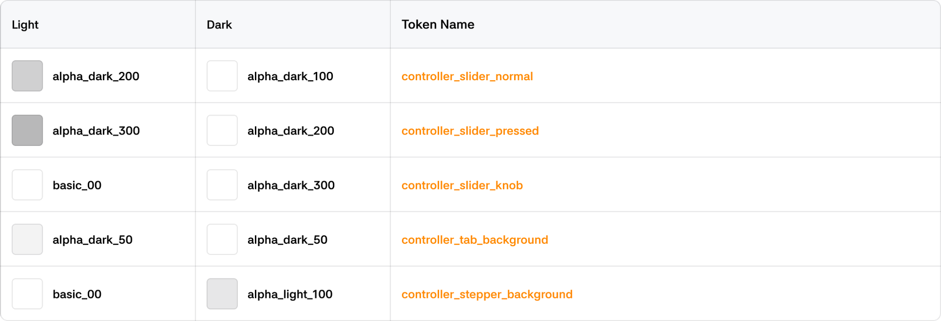
Controller
Climate
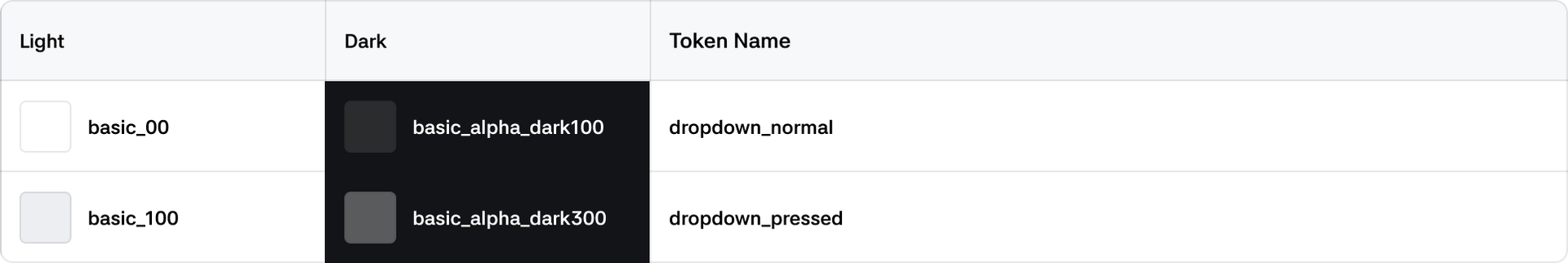
Dropdown
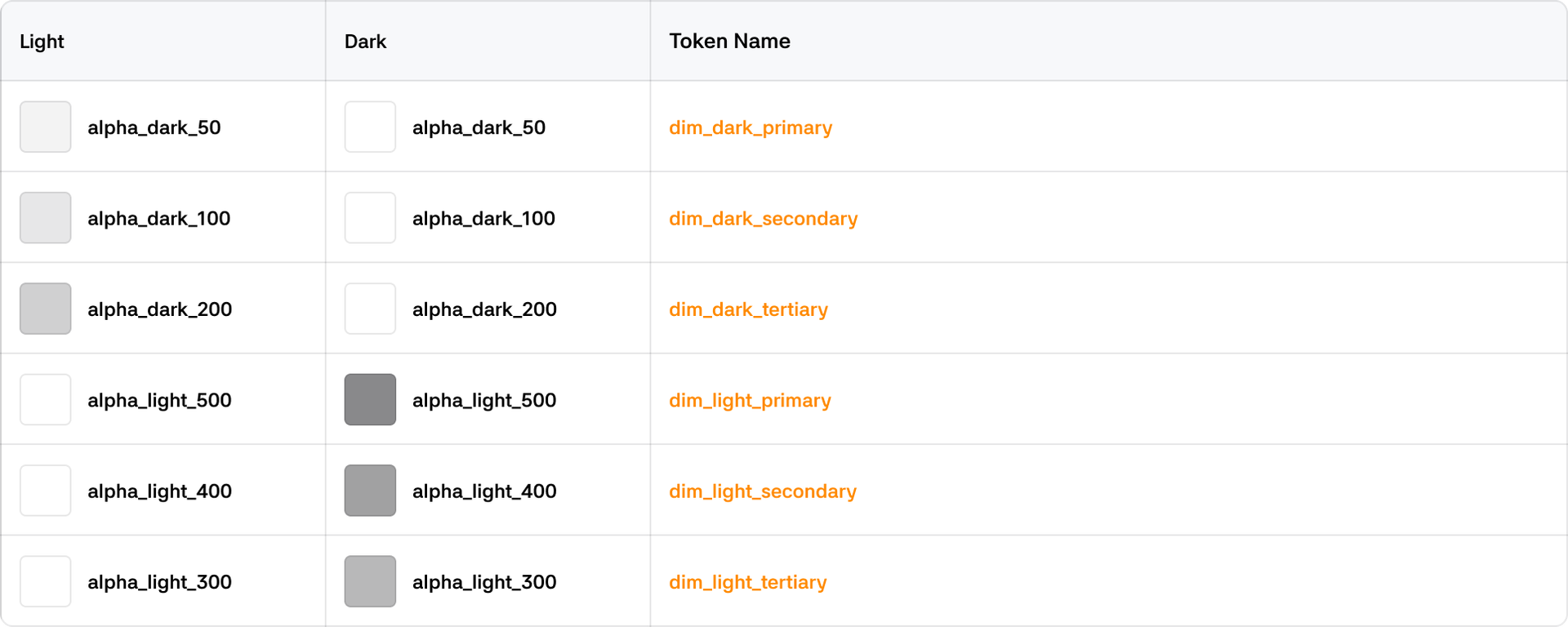
Dim
Driving
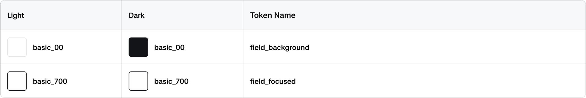
Fields
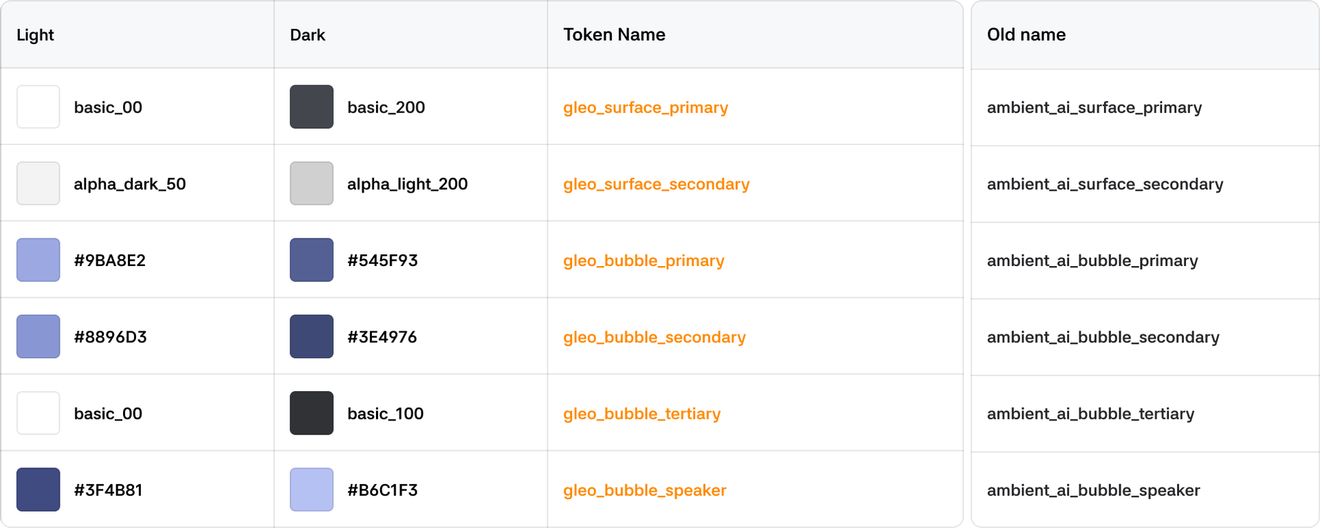
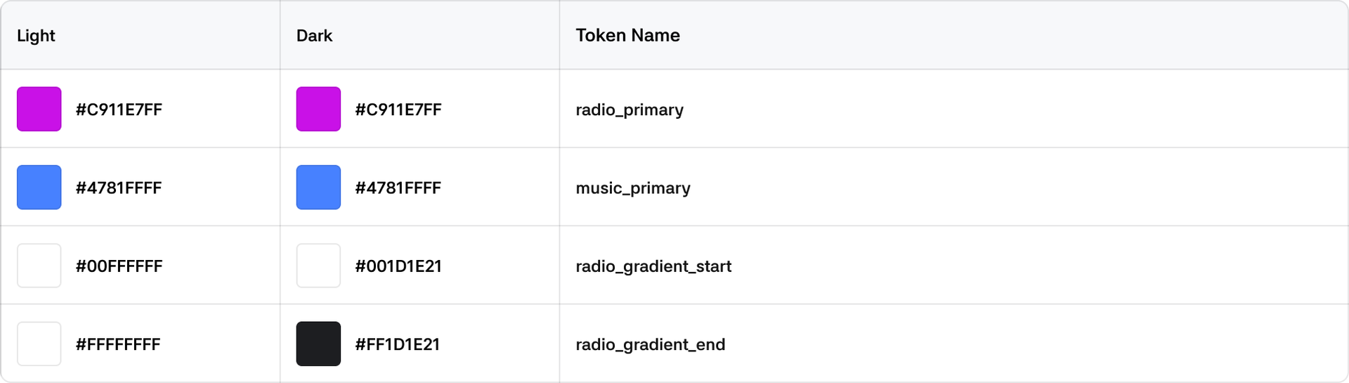
Gleo AI
Icon
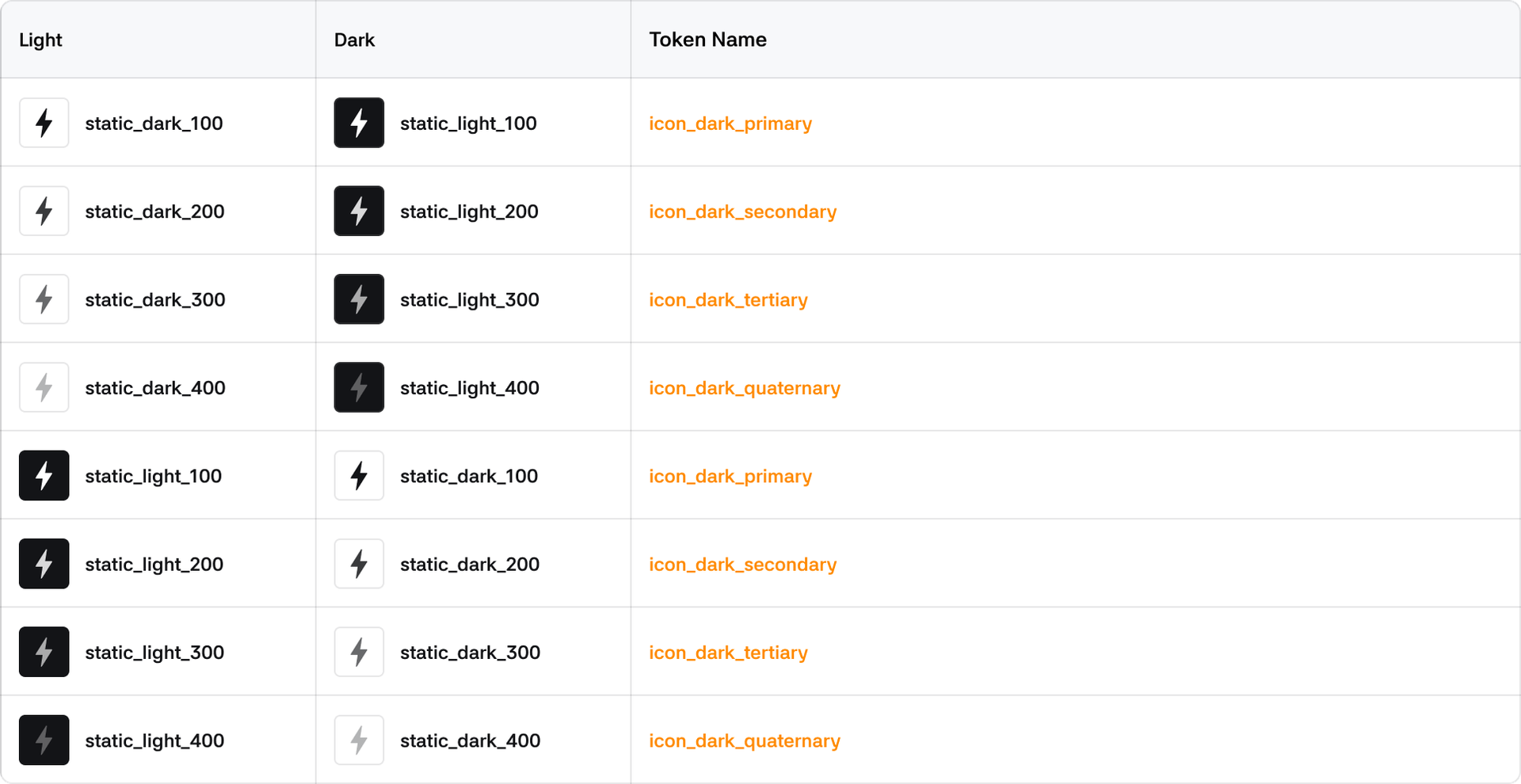
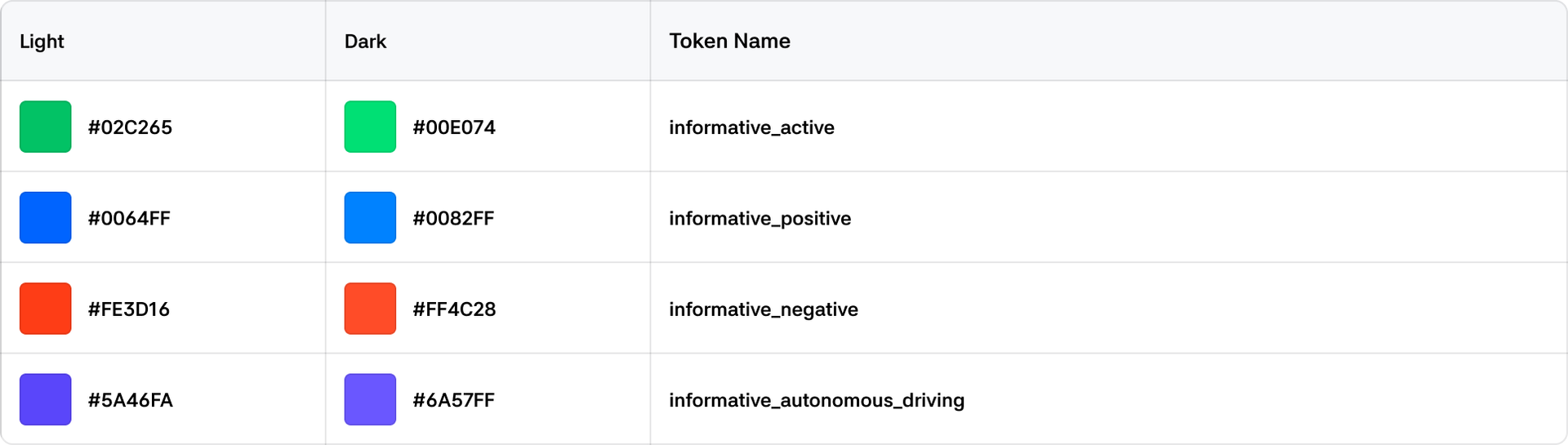
Informative
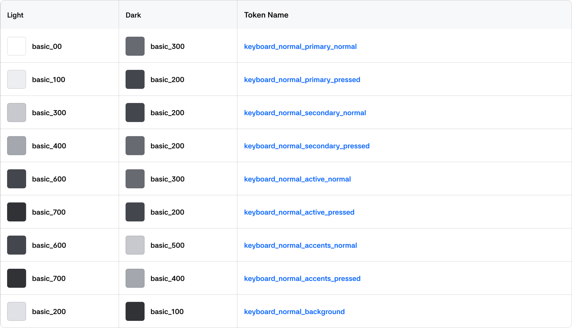
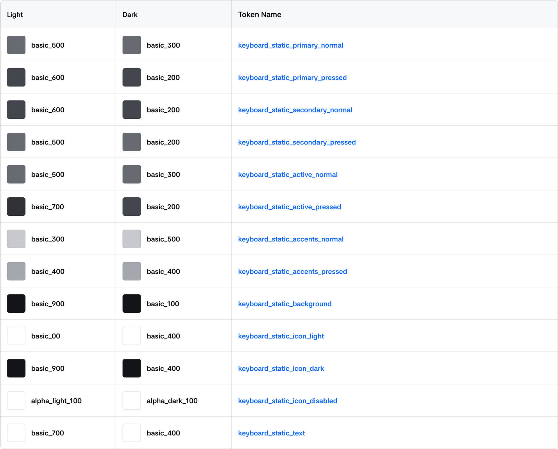
Keyboard
Normal
Static
Media
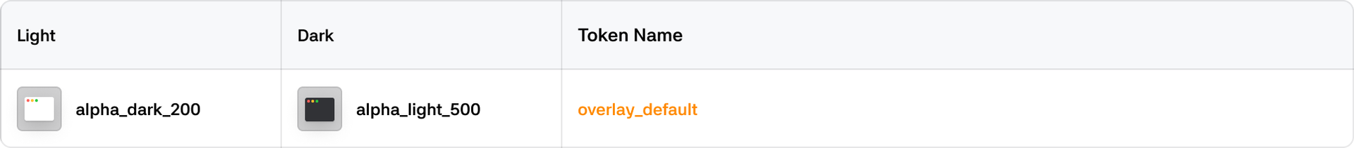
Overlay
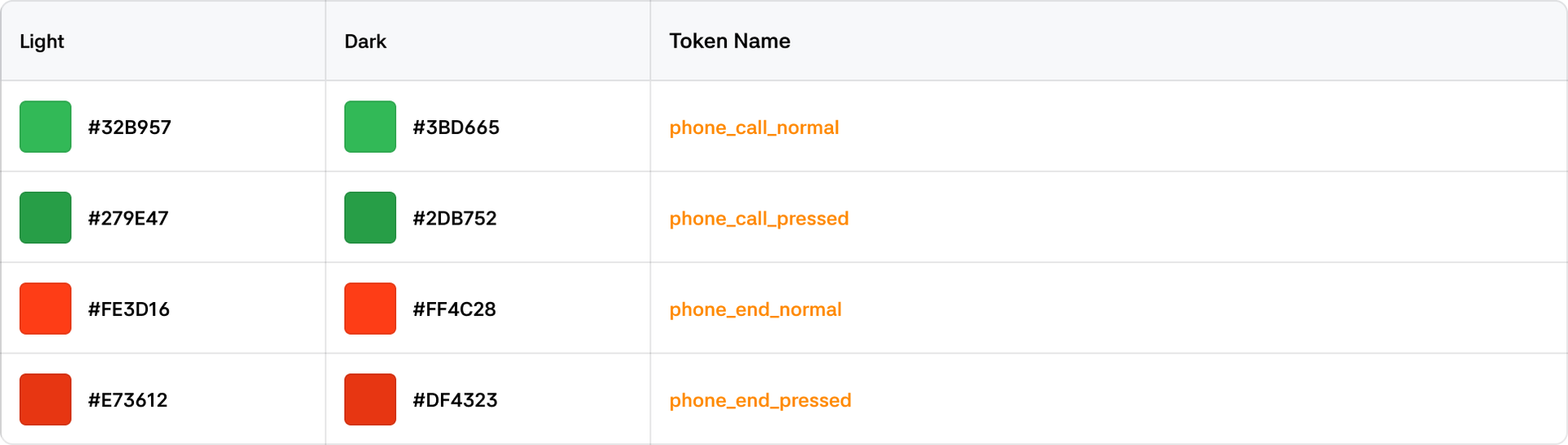
Phone
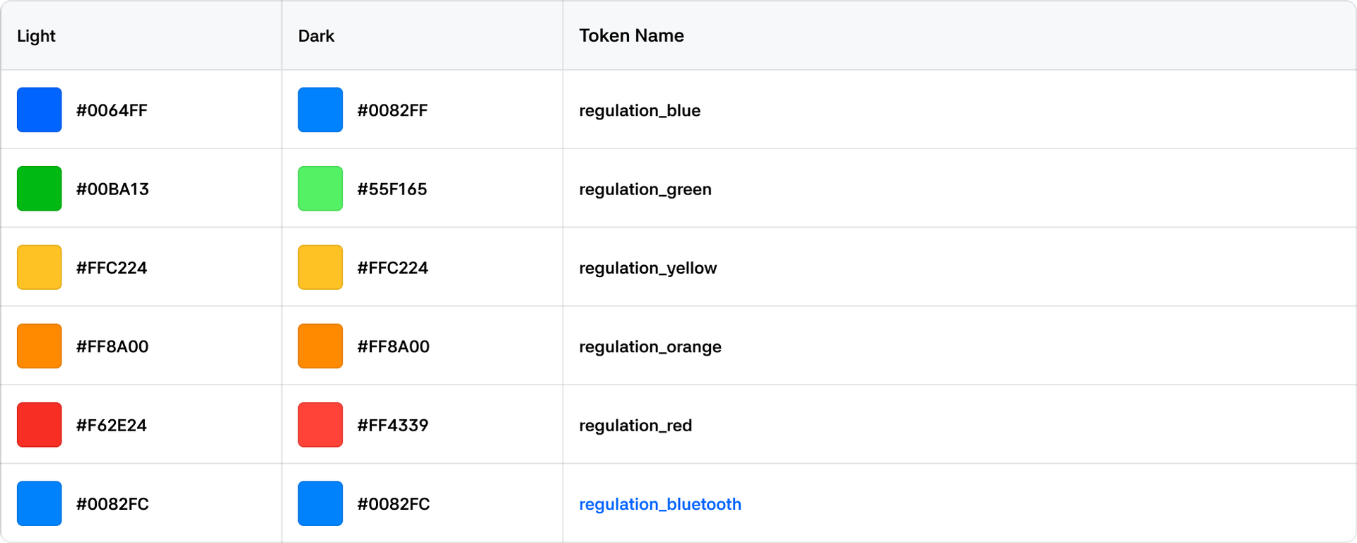
Regulation
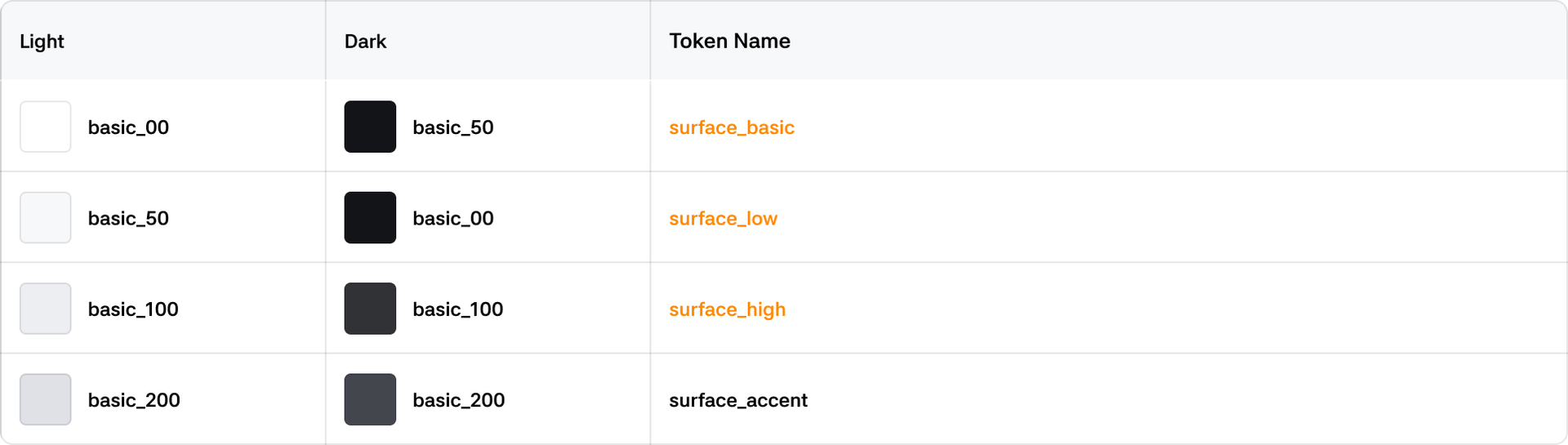
Surface
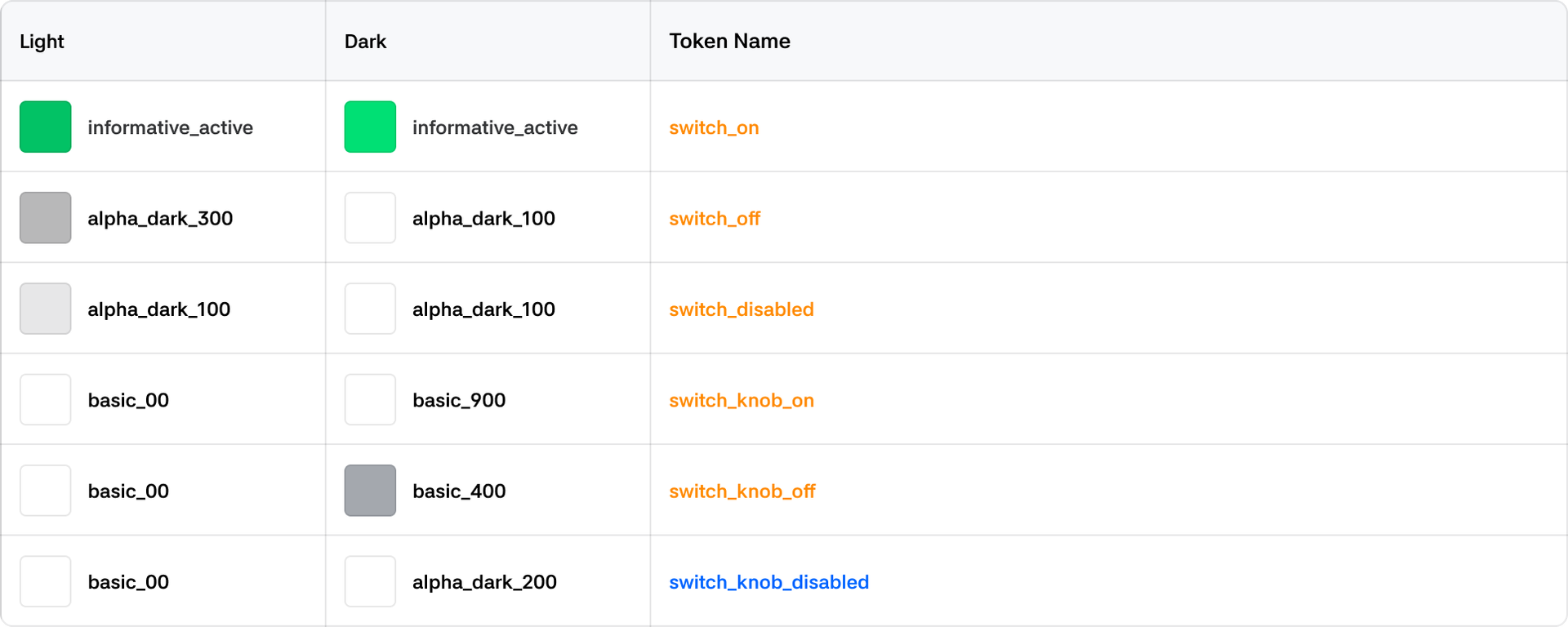
Switch
Text